Turning an Optimization Algorithm into a Strategic Graphical User Interface
Surgical Scheduling Platform Case Study
Overview
The Problem
A major pediatric hospital had developed an optimization algorithm capable of processing surgical scheduling across 15+ variables (surgeon availability, OR capacity, equipment, patient priority, bed capacity, staff shifts).
But the algorithm was isolated. Its insights were locked away.
- Directors made high-level decisions without predictive modeling
- Division Managers toggled between multiple systems to see complete schedules
- Booking Clerks spent 2-3 hours daily on manual conflict detection
- The algorithm's potential was trapped in Excel files no one could interpret

The Design Challenge
Design a system that translates the algorithm into actionable insights for three organizational levels—without overwhelming users or adding to their workload. The goal was to make it accessible to diverse users involved in planning.
My Role:
Lead UX & Product Designer
Team:
Cofounder
Engineer & Developer
Healthcare Advisors
Timeline:
Feb–Sept 2022 (Design & Research)
2024–25 (AI Refinement)
1. Research: Understanding the Multi-Level Ecosystem
I spent the first months conducting comprehensive stakeholder research with no existing user research to build on. I needed to understand workflows and decision-making at each organizational level.
Three Decision Levels, Three Different Needs

The Algorithm Was Complex But Inaccessible

15+ Inputs → Algorithm → 7+ Outputs
Example: When a surgeon requests a 2-hour knee surgery for a Priority 2 patient, the algorithm needs to check 15+ constraints: surgeon availability, OR room capacity, equipment sterilization schedules, post-op bed availability, anesthesiologist assignments, nursing shifts...
Manually, booking clerks took 20+ minutes per case to check these constraints. The algorithm could do this in seconds—but only if decision-makers had access to its outputs through an intuitive interface.
The challenge: Make this complexity manageable across three user levels with vastly different needs.
2. Design Strategy
Core Principle: Different Decisions Need Different Interfaces
Rather than one-size-fits-all, I designed a hierarchical platform:
- Users enter at their organizational level
- Access appropriate detail for their decisions
- Drill down when needed without cognitive overload
Key Design Decisions
File Upload System
- Include the option of uploading existing Excel files (no manual re-entry)
- Addresses fear of "too time-consuming"
Scenario-Based Planning
- Create named scenarios ("Open OR on Saturdays")
- Compare predicted outcomes before committing
Progressive Disclosure
- Summary KPIs at every level
- Drill down for details when needed
3. Initial Design Concepts (2022)
Design Approach
Based on the research findings, I created initial design concepts that established the visual direction and core functionality for the surgical scheduling dashboard.
Key Concept: Dashboard & OR Schedule View
Initial concept showing KPI dashboard and scenario comparison view with color-coded surgical services
Design Priorities
📊
Visual Hierarchy
Prioritized KPIs in sidebar with clear metrics for decision-making
🎯
Color-Coding System
Distinguished surgical services (Dent, ENT, Ortho, etc.) for quick pattern recognition
⚡
Scenario Planning
Enabled "what-if" analysis for testing different OR allocation strategies
4. User Testing & Critical Feedback
After creating the initial concepts, I conducted extensive user testing sessions with Division Managers, Booking Clerks, and Directors. The feedback revealed specific improvements needed:
Critical Improvements Identified
1. File Upload System
User Quote: "Information from so many resources that inputting would be too time-consuming"
Needed: Excel file import capability to eliminate manual data entry burden
2. Schedule Snapshot View
User Quote: "16 surgeons hard to visualize" - need complete overview at a glance
Needed: Condensed snapshot view with hover details showing surgeon assignments and bed usage
3. Enhanced Scenario Testing
Finding: Directors need to model policy changes before implementation
Needed: Side-by-side scenario comparison with predicted KPI outcomes
4. Better Visual Polish
Feedback: Color palette needed refinement, charts needed better labels and context
Needed: Design system with documented color tokens, improved data visualization quality
5. The Solution: From Concept to Pilot
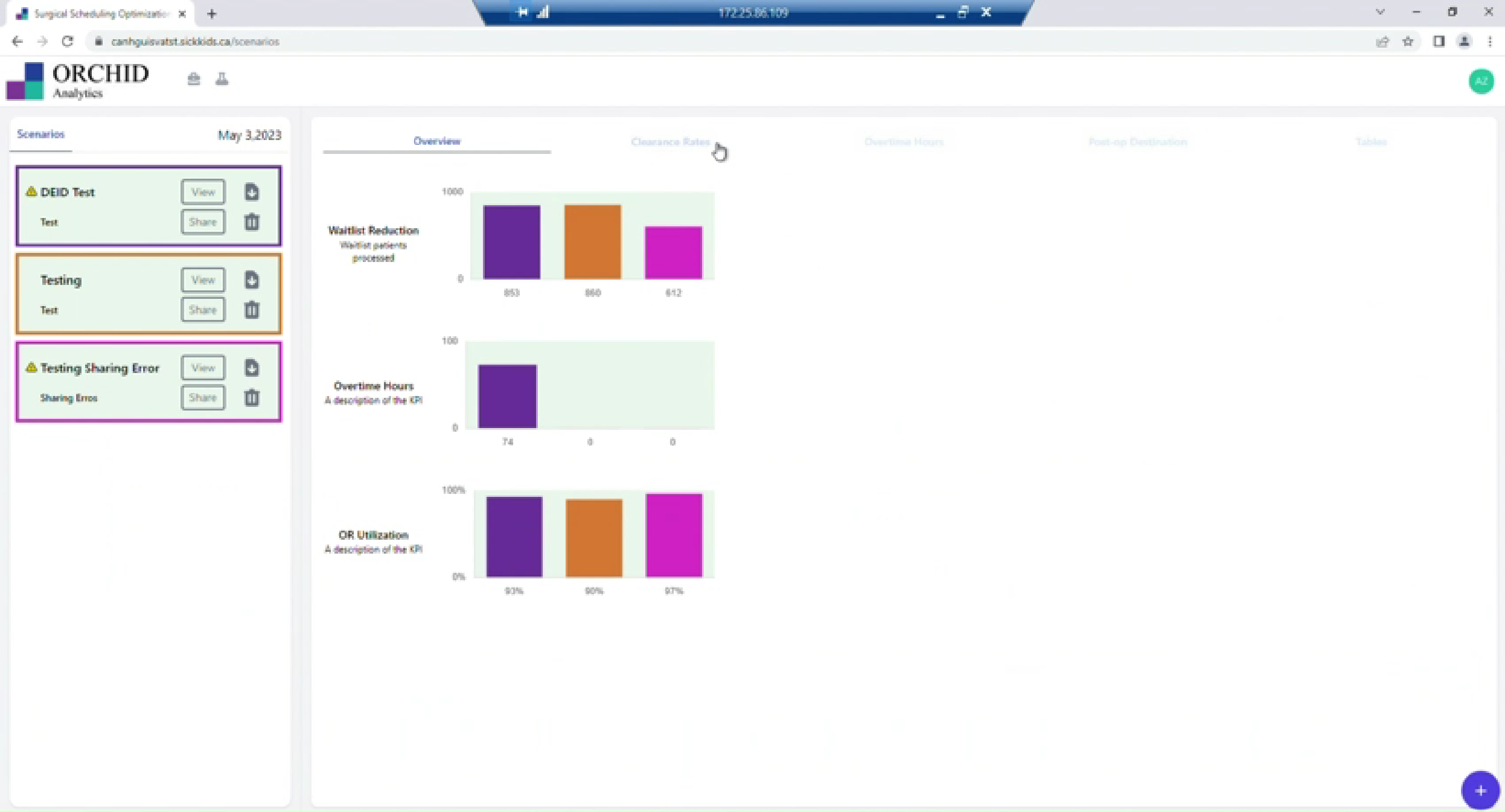
Due to healthcare technology constraints (budget, timeline, technical dependencies), we launched a pilot focusing on core functionality. Here's what shipped and why it mattered.
Note: Due to healthcare data privacy requirements and system access restrictions following project completion, production screenshots shown below are simplified representations. The AI-refined designs in Section 8 demonstrate the full visual design evolution and refinement process.
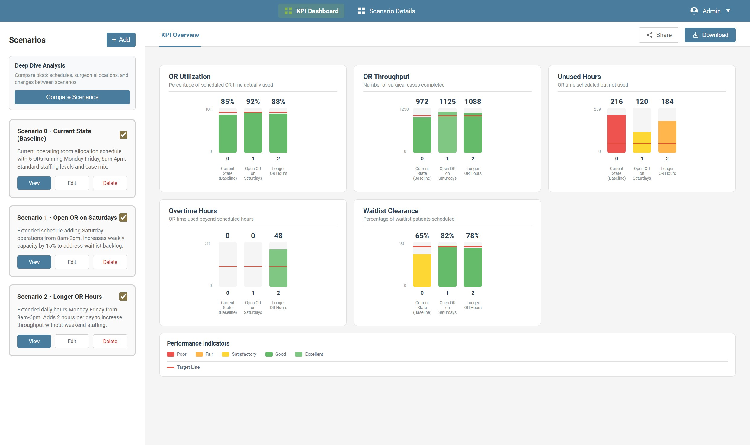
Strategic Level: Scenario Modeling
What Directors Need: Test policy changes (e.g., "Open ORs on Saturdays") and see predicted impact before implementation.
KPI Comparison Dashboard
What Shipped:
- Side-by-side scenario comparison
- Color-coded performance indicators (red/yellow/green)
- Key metrics: OR Utilization, OR Throughput, Unused Hours, Overtime, Waitlist Clearance
- Target threshold visualization
Directors could now model policy changes in minutes rather than implementing and waiting months for results.
Scenario Creation & Upload
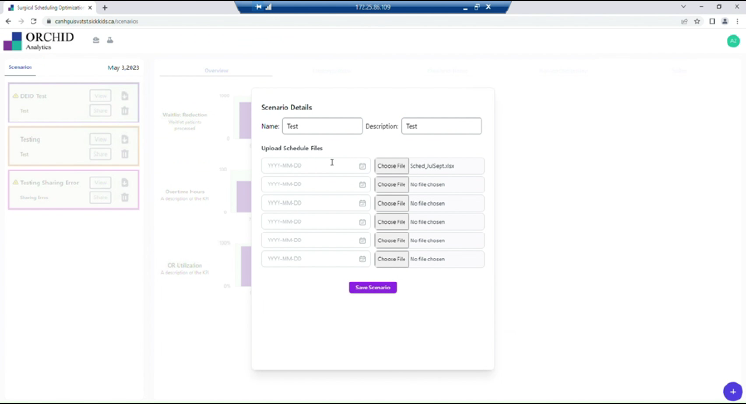
What Shipped:
- Named scenario creation (self-documenting)
- Excel file upload (leverages existing data)
- Background algorithm processing
- Multiple scenario support
Why It Worked: Users could test scenarios using existing files without manual data entry—directly addressing the "too time-consuming" fear.
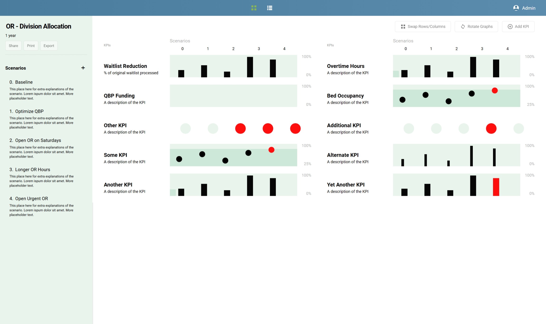
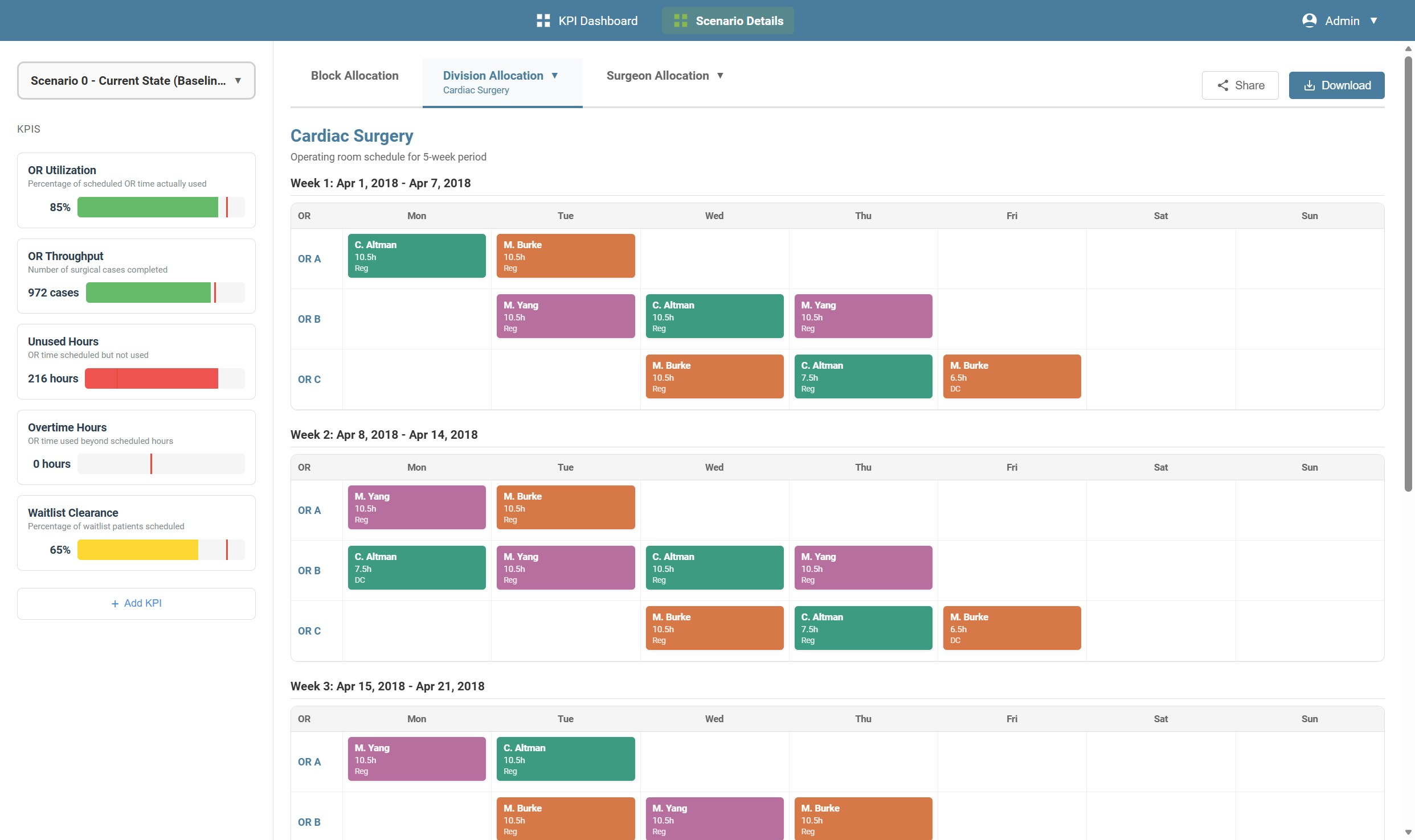
Tactical Level: Division & Surgeon Allocation
What Managers Need: Allocate OR blocks to surgeons quarterly, manage complex schedules (e.g., 16 surgeons in Orthopedics), see complete picture without system-switching.
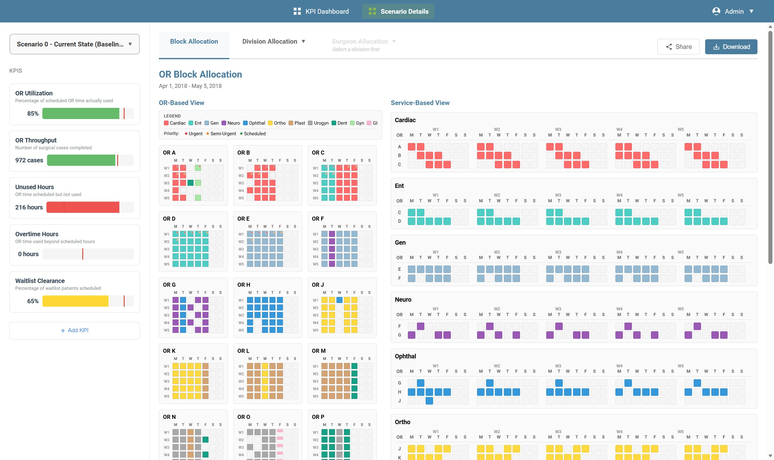
Master Block Allocation View
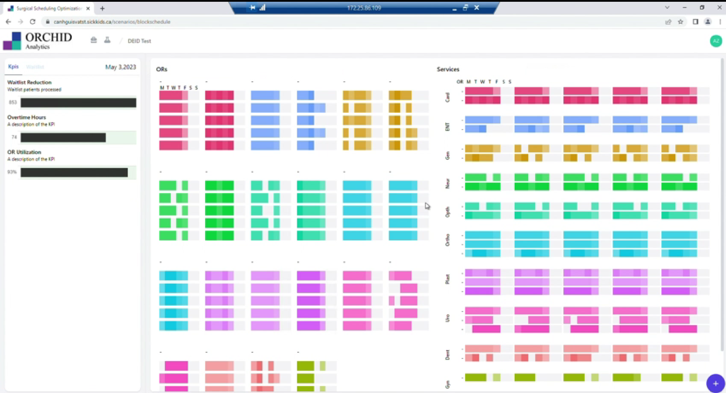
What Shipped:
- Dual visualization: OR schedule vs. Service distribution
- 5-week planning view
- All surgical services visible (Cardiac, ENT, General, Gastro, Gyn, Ortho, Plastics, Urogyn)
- Urgent vs. Scheduled differentiation
- Day-by-day granularity (M/T/W/T/F/S/S)
Strategic Insights Enabled:
- Service distribution patterns
- Under-utilized vs. over-allocated services
- Weekend coverage gaps
- Balance across surgical services
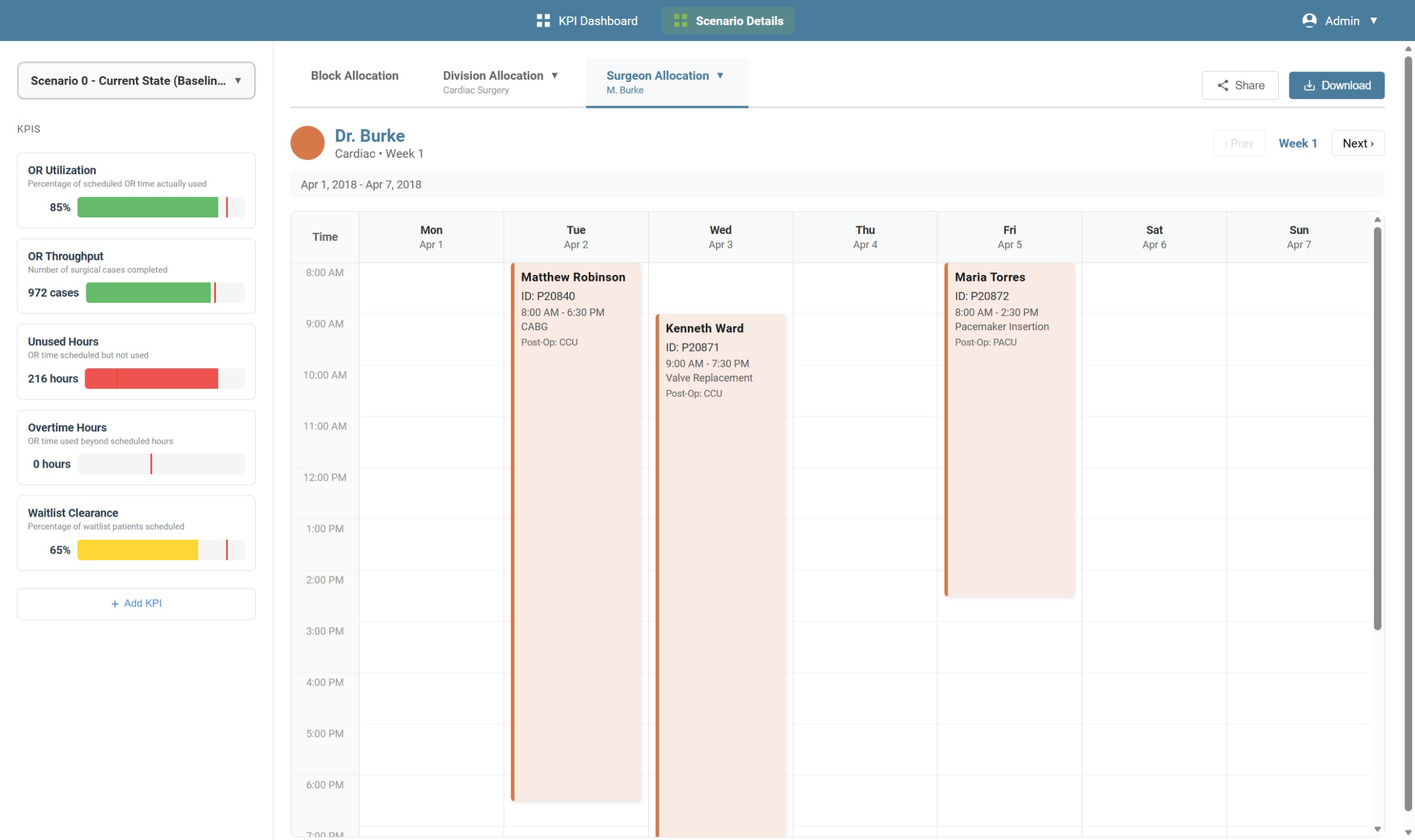
Surgeon Schedule Management
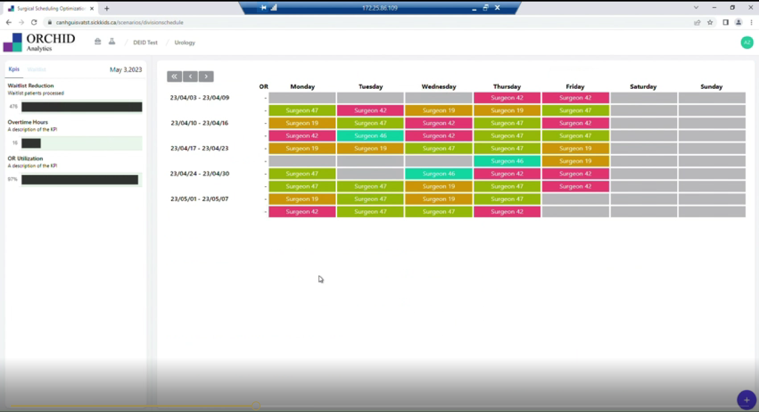
What Shipped:
- Weekly schedule across multiple ORs
- Filter by division/service
- Individual surgeon blocks with timing
- KPI sidebar for context (Waitlist Reduction, Overtime, Utilization)
Operational Level: Daily Scheduling
What Clerks Need: Schedule patients efficiently, avoid conflicts, manage urgent cases, track bed availability—without 2-3 hours of manual work.
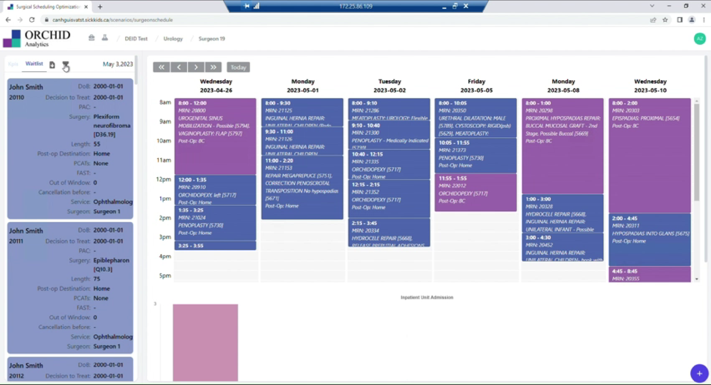
Patient Allocation & Waitlist
What Shipped:
- Persistent waitlist sidebar (patient details always visible)
- Priority and wait time sorting
- Calendar view with procedure color coding
- Bed capacity visualization at bottom
- Filter by surgeon
Key Features:
- Waitlist shows: Patient info, priority (PCAT), days waiting, surgeon, procedure type
- Calendar shows: Allocated procedures, timing, service color coding
- Bed capacity prevents over-allocation
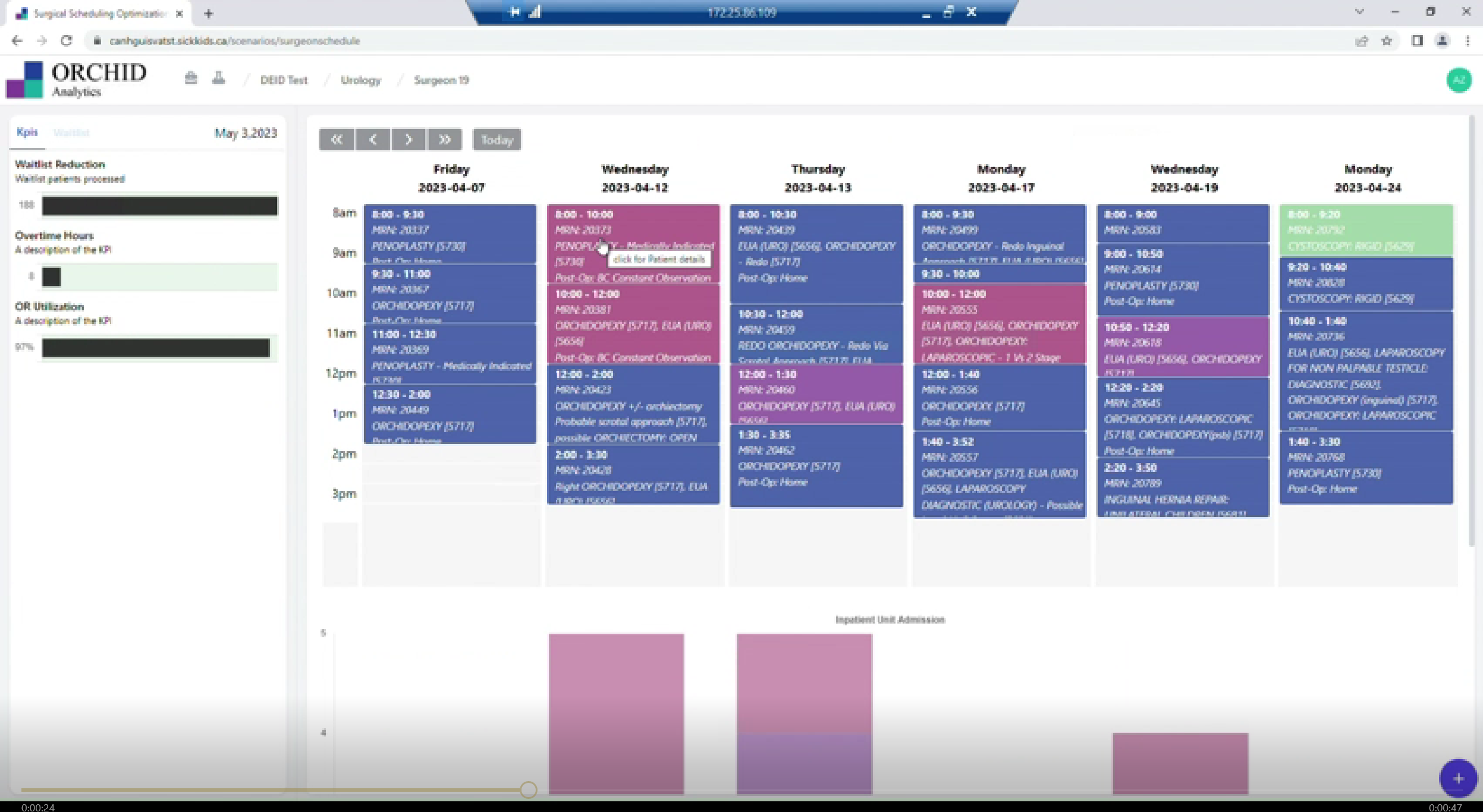
Detailed Booking Schedule
What Shipped:
- Complete patient details in sidebar (Name, MRN, DoB, Decision to Treat date, PCAT priority score, Surgeon, Procedure length, Post-op destination, FAST indicators, Out of Window warnings)
- Time-block calendar view (8am-5pm)
- Multiple procedures per OR per day
- Inpatient unit admission tracking
- Week navigation with "Today" quick-access
6. Pilot Outcomes & Learnings
What Shipped Successfully
- Directors could model scenarios and see predicted outcomes
- Managers gained unified views eliminating system-switching
- Clerks could leverage algorithm optimization for conflict checking
- Core KPI tracking worked across all three levels
User Feedback
"This is exactly what I needed—I can finally see the complete picture without jumping between systems"
— Division Manager (Pilot feedback)
What I Learned
1. Translating Algorithms into Human Interfaces
Don't expose algorithmic logic directly. Show outcomes in business language, not technical terms. Provide override capabilities with explanations.
2. Designing for Three Audiences
Hierarchical architecture with consistent navigation works better than separate dashboards. Users can drill from strategic → tactical → operational fluidly.
3. Respecting Existing Workflows
The file upload system was critical. Users already had data in Excel. Forcing manual re-entry would have killed adoption. Meet users where they are.
4. Real-World Constraints
Perfect is the enemy of shipped. Core functionality proving value > polished interface with less function. Iterative improvement beats never launching.
What I'd Do Differently
- Build in more buffer for technical constraints in healthcare IT
- Create more lightweight mockups for faster iteration
- Document user feedback more systematically during pilot
7. AI-Assisted Design Velocity: 2025 Refinement
From Concept to Visual Refinement
Three years after the pilot launched, I used AI design tools to validate and refine the visual design in one week—a process that would have taken 1-2 months traditionally.
This demonstrates two key capabilities:
- Modern design velocity: Rapid iteration using AI tools to explore 30+ variations per screen
- Design thinking: Knowing which refinements solve user problems (better hierarchy, clearer patterns, improved contrast)
The comparisons below show how the original pilot concept evolved into polished, production-ready interfaces.
Validated Improvements: Before/After
Strategic: Scenario Comparison
PILOT CONCEPT (2022)
✨ AI-REFINED (2025)

Improvements:
- Enhanced data visualization
- Better visual hierarchy
- Improved color contrast
- More contemporary patterns
Impact: Faster executive decision-making
Tactical: Surgeon Allocation
PILOT CONCEPT
✨ AI-REFINED
Improvements:
- Clearer surgeon attribution
- Better timeline visualization
- Refined color palette
Impact: Instant pattern recognition for complex schedules
Operational: Patient Allocation
PILOT CONCEPT
✨ AI-REFINED
Improvements:
- Enhanced waitlist hierarchy
- Better patient cards
- Clearer priority indicators
Impact: Faster information processing for daily scheduling
Strategic: Overview Dashboard
PILOT CONCEPT
✨ AI-REFINED
Improvements:
- Cleaner visual hierarchy
- Enhanced heatmap patterns
- Better spacing
Impact: Improved pattern recognition for resource allocation
The Refinement Process
1. Analyze Pilot Feedback
Review user feedback from pilot: visual hierarchy issues, color contrast problems, cluttered layouts
2. Generate Variations
Use AI tools to explore 30+ design variations per screen—testing different layouts, color schemes, and data visualizations
3. Curate & Validate
Evaluate outputs against user needs and design principles, selecting refinements that improve clarity and usability
What AI Tools Enable
Exploration Breadth
Traditional: 2-3 variations (time constraints)
AI-assisted: 30+ variations explored
Result: 10x more design exploration in same time
Iteration Speed
Traditional: ~1 week for 4 refined screens
AI-assisted: 3 days for same output
Result: 2-3x faster delivery
Focus Shift
Less time pixel-pushing
More time evaluating which direction solves the problem
More time on strategic decisions
Skills This Demonstrates
- Prompt engineering - Translating requirements into effective prompts
- Quality curation - Evaluating AI outputs against user needs
- Rapid prototyping - Testable artifacts in days
- Strategic thinking - Knowing what to improve and why
- Modern tooling - Staying current with emerging capabilities
Why This Matters
The original project shows my design thinking, research, and problem-solving.
The AI-assisted refinement shows I can work at the speed of modern product development.
Both skills matter in 2025.
10. Conclusion
From Algorithm to Action
This project transformed an isolated optimization algorithm into a comprehensive decision-making platform serving three organizational levels. By conducting deep user research, designing for real constraints, and prioritizing functionality that proved value quickly, we successfully launched a pilot that demonstrated the concept's potential.
Three years later, using AI tools, I validated refinements in 3 days that would have taken ~1 week traditionally—demonstrating modern design velocity that accelerates product development.
Key Contributions
Research & Strategy
- 7 user personas across 3 organizational levels
- Translated 15+ algorithmic variables into usable interfaces
- Identified three-level hierarchical architecture
Design & Implementation
- Scenario modeling system for million-dollar decisions
- Unified views eliminating system-switching
- Visual system scalable across complexity levels
- Pilot implementation under real-world constraints
Modern Capabilities
- AI-assisted refinement (2-3x faster iteration)
- 10x more design exploration
- Validated improvements in 3 days
Company name and personnel names have been changed to protect confidential information.